There is a kind of rejection you never find out about. You spend a Sunday afternoon on a résumé in a template that looks genuinely good — two columns, a slim skills sidebar, a restrained accent colour, maybe a row of little proficiency bars next to your software names. You export it, apply, and close the laptop feeling like you did the work. What you don't see is what happens about ninety seconds later, when the company's applicant tracking system opens the file and tries to turn it into a database record. The parser reads your two columns in the wrong order. Half the sidebar lands in a field nobody queries. Your job titles get glued to the wrong dates. A recruiter never rejects you, because a recruiter never sees a version of you worth reading.
That's the failure this article is about, and the fix is smaller than most people expect. It isn't better wording, a stronger summary, or a cleverer opening line. It's the container. This guide covers the template we rank as the best ATS résumé format for 2026 — where it came from, the parsing evidence behind it, how to fill in every section without writing filler, and how to build it free in a browser. Fair warning: it is not the prettiest layout you'll see today. That is the entire point.
Your template decides whether your words arrive at all
Most job-search advice lives at the level of wording — the stronger verb, the tighter summary, the opening line that hooks. Wording matters. But it sits downstream of a blunter question: does the text survive the trip? Before anyone reads a bullet, your file goes through machinery that decides whether you exist as a clean, searchable candidate or as a mangled record that quietly ranks below people with weaker experience than yours.

Gate one is the parser — software that reads your PDF and rebuilds it as structured data: name here, employment history there, skills over there. Gate two is an AI screening layer that scores and ranks that structured record against the job description. Gate three is a human recruiter, who on the first pass spends roughly seven seconds, according to Ladders' eye-tracking work. A template cannot invent achievements for you. What it can do is guarantee the parser reads you accurately, hand the AI clean text to match against, and put your strongest material where a seven-second skim actually lands. For fifteen minutes of setup, nothing else in a job search returns that much.
It also explains a pattern that drives people slightly mad: two candidates with similar backgrounds apply to the same role, and the one with the thinner CV gets the call. Often the difference isn't merit. It's that one file parsed into fourteen clean fields and the other parsed into six.
Where the winner came from: the quiet story of "Jake"
The template we rank first didn't come out of a résumé company or a design studio. It came from a computer-science student named Jake Gutierrez, who in 2020 published a plain LaTeX résumé template on Overleaf and GitHub under a permissive open-source licence, adapted from an earlier community layout. He wasn't launching anything. He wanted a clean résumé and shared the source.
What happened next is the interesting part. On Reddit communities like r/EngineeringResumes and r/cscareerquestions — where thousands of people submit their CVs every week specifically to have strangers pull them apart — "Jake's Resume" became the default recommendation. Not because anyone found it beautiful. Because it kept working. It parsed cleanly, recruiters at large employers recognised the shape of it instantly, and it fit a surprising amount of substance onto one dense, readable page. Word of mouth carried it through exactly the population most likely to be filtered out by aggressive ATS pipelines. A format that survives years of public teardowns from hiring engineers has been stress-tested harder than anything shipped with a marketing budget.
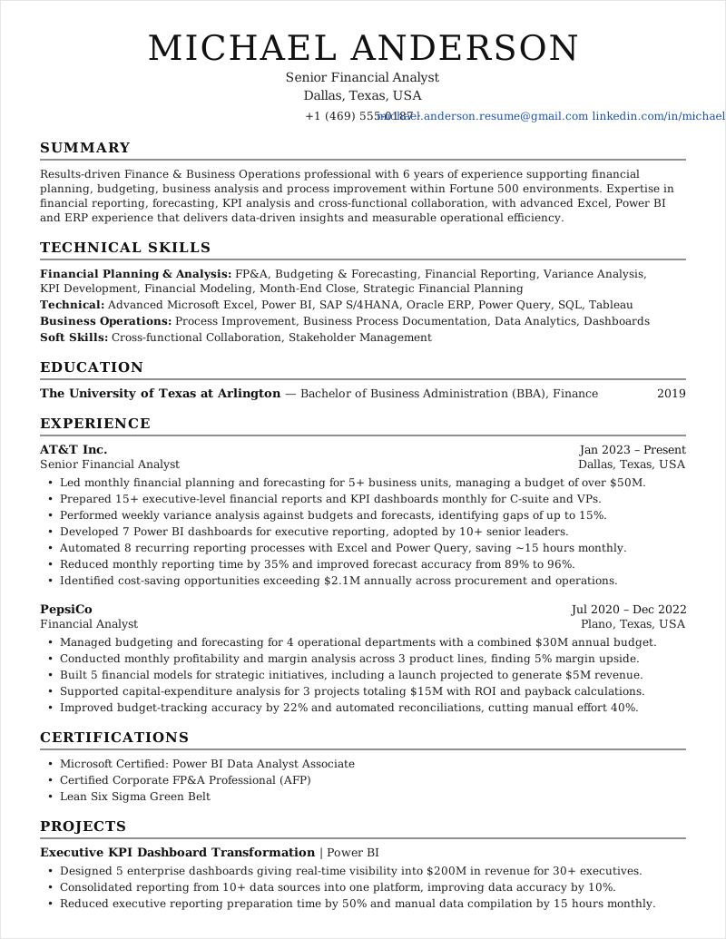
Here's the part that gets missed. Nothing about this format is specific to software. The example above is a financial analyst, not an engineer. The same four properties that make it bulletproof for a developer — one column, standard headings, real text, tight quantified bullets — make it bulletproof for a staff nurse, a category manager, a secondary-school teacher, a warehouse supervisor, or a fresher with one internship and a decent final-year project. That universality is why we picked one template instead of publishing a gallery of fifteen and letting you guess. EvoResume ships it as the free Jake template: a faithful web port you fill in through a browser, with no LaTeX toolchain anywhere in sight.
Why it parses when better-looking templates don't
This is where the phrase "ATS-friendly" stops meaning much, because almost every template on the internet is sold with that label and plenty of them aren't. A layout can look thoroughly modern and still be close to unreadable to a parser. The gap comes down to six deliberately dull decisions.

1. One column, because parsers read like readers
An ATS reads a page the way you read English: top to bottom, left to right. A two-column layout breaks that assumption immediately, and parsers respond by interleaving the columns, reading one and skipping the other, or stitching a sidebar heading onto an unrelated paragraph. In an analysis of 1,000 rejected résumés processed through Workday, Taleo and Greenhouse, single-column layouts parsed at roughly 93% accuracy against 86% for two-column ones. That gap sounds survivable until you look at where the loss concentrates. Skills sections — the block keyword matching cares about most — parsed at about 65% accuracy in a single column but only 36% in two. Park your skills in a sidebar and you can lose half of them before scoring begins.
Two-column "modern" template: skills and dates live in a coloured sidebar, get read out of order or dropped entirely, and your keyword match craters without any visible error.
Single-column template: every section read in the order you wrote it, so skills, titles and dates land in the fields the ATS actually queries.
2. Headings the parser already knows
Parsers map your document by looking for section names they recognise. Experience, Work Experience, Education, Skills, Projects, Certifications. Write "Where I've Made an Impact" instead of "Experience" and you haven't shown personality — you've handed the parser an unlabelled block of text and hoped it guesses. It usually doesn't. Keep the headings plain and spend your personality budget on the bullets, where a human will actually enjoy it.
3. Real text, not a picture of text
If you can't highlight a word in your PDF with the cursor, neither can the ATS. Résumés exported as images, designed in tools that flatten output, or scanned from a printed copy arrive as a rectangle of pixels. Some systems run OCR; many don't, and the ones that do introduce their own errors. This is the single most catastrophic and most invisible failure on the list — the file opens perfectly on your screen, which is exactly why nobody checks.
4. No tables, no text boxes
Tables are the sneakiest offender because people use them for alignment rather than for data — a two-cell table to push dates to the right margin, a text box to keep contact details tidy. Inside a parser, content in a table cell is frequently read in the wrong order, merged with a neighbouring cell, or skipped. If your alignment depends on an invisible grid, your résumé depends on it too.
5. Reverse-chronological, dates on clean single lines
Recruiters and parsers both want to answer the same question fast: what have you been doing, and when? Most recent role first, one line per role, dates right-aligned in a consistent format (Mar 2023 – Present, not 3/23-now in one place and March 2023 to date in another). Consistency here also protects you from a specific harm: inconsistent date formats are a common cause of phantom employment gaps in a parsed record.
6. Bullets that end in a number
Formatting gets you read. Content gets you ranked. The template earns its keep by putting a quantified achievement bullet exactly where the eye and the AI both look first — but you have to supply the number. More on that in a moment, because it's where most otherwise-correct résumés lose.

What changed in 2026: clearing the parser is no longer enough
A lot of ATS advice on the internet is quietly stuck in 2019, when getting parsed correctly was most of the battle and keyword matching was mostly literal string matching. That's not the pipeline anymore. There's now a screening layer between the parser and the recruiter that reads for meaning, and it can tell the difference between "responsible for monthly reporting" and "rebuilt the monthly reporting pack into 7 dashboards used by 10+ senior leaders, cutting close time 35%." Both contain the word reporting. Only one describes a person who did something.
There's a second-order effect worth knowing about. Because the screening layer reads semantically, it also notices text that reads like it was generated to game a filter. Keyword-stuffed skill lists and paragraphs of synonym soup used to be a cheap edge; now they're a signal. Write for the human at gate three and you tend to satisfy gate two automatically, which is a rare piece of good news in this whole process.
Filling it in, section by section
Work top to bottom. The structure does the heavy lifting; your job is to feed each section the kind of content it's shaped for.
- Header. Full name, a professional email address, phone with country code if you're applying internationally, city and country, and one or two live links — LinkedIn, GitHub, portfolio. Plain text on plain lines. No photo (it adds nothing in the US, UK, Canada or Australia and can actively cause problems), no icon fonts, nothing inside a box.
- Summary. Two or three lines: your role, years of experience, two or three core strengths, and one headline result. Use the exact job title from the posting if it's honestly yours — "Senior Financial Analyst" beats "Finance Professional" for both the matcher and the skim. Skip the objective statement; nobody has wanted one since about 2012.
- Experience. The core of the document. Reverse-chronological, one line for title, company, location and dates, then three to six bullets. Every bullet starts with an action verb and ends somewhere concrete: revenue, percentage, headcount, hours saved, volume handled, scope owned.
- Education. Degree, institution, graduation year, and honours or GPA only if they're strong. Freshers and recent graduates put this above Experience; everyone with two or more years of work puts it below and keeps it to two lines.
- Skills. A compact, categorised list in the job posting's own vocabulary — if they say "Power BI" don't write "MS BI tools". This is the most heavily scanned block on the page, so keep it accurate, specific, and in the main column where it can be read.
- Projects, certifications and extras. Optional for senior people, decisive for students and career-changers. Two to four entries, each with a one-line outcome and a link if one exists. A shipped side project with real users is worth more than a fourth bullet about a job you left in 2019.
The bullet is where résumés are won and lost, so here's the transformation in the only form that matters — a real before and after:
Responsible for managing the company's social media accounts and increasing engagement across platforms.
Grew combined LinkedIn and Instagram following from 4k to 31k in 11 months, lifting inbound demo requests 22% quarter over quarter.
If you're stuck on numbers because your work isn't obviously measurable, ask three questions of each bullet: how many, how much, how often. How many people, tickets, accounts, students, beds, sites, releases? How much money, time, error rate, budget? How often — daily, weekly, at what volume? Almost every job produces an honest number under that interrogation. If you're rewriting a CV to move industries, the related problem of translating those numbers is covered in our guide to changing careers without lying on your résumé.
How it holds up outside tech
The most common objection we get is some version of "that's fine for engineers, but my field is different." Usually it isn't — but the emphasis shifts, so here's how the same skeleton adapts:
- Freshers and students: Education moves above Experience, and Projects does the work Experience can't yet. Coursework counts if it produced something; a list of module names doesn't. See the fresher CV format guide.
- Healthcare and nursing: licences, registration numbers and certifications get their own section high on the page, because that's the first thing screened for. Everything else stays identical.
- Finance and banking: lead with the numbers you moved — portfolio size, budget owned, variance reduced. This is the field where quantified bullets are easiest and most often wasted.
- Designers and creatives: the hardest case, and the answer is two files. Apply through the portal with the single-column version, and put the beautiful work behind a portfolio link in the header. Do not send the visual PDF through an ATS and hope.
- Government, NGO and academic: these often want longer documents and specific fields (grant numbers, publications, clearance levels). The single-column rule still holds; the page limit doesn't.
- Career-changers: keep reverse-chronological order and use the summary and bullet framing to bridge, rather than reaching for a functional format that recruiters distrust and parsers mishandle.
Build it in your browser, no LaTeX required
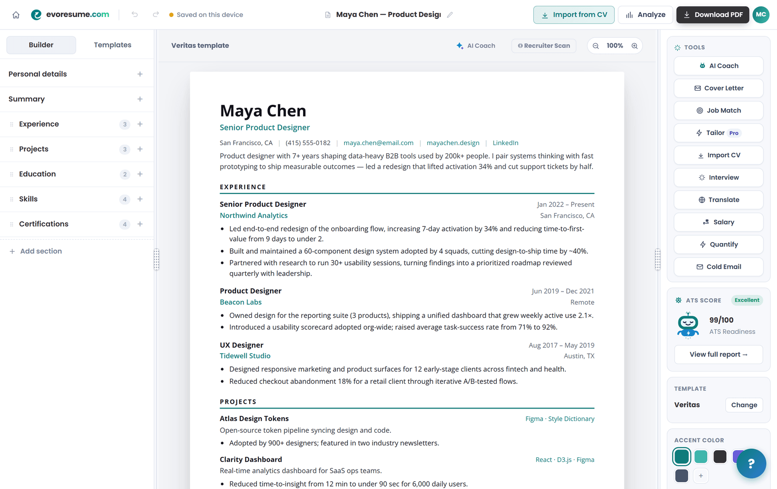
The catch with the original template was always LaTeX. It's a typesetting language: excellent output, real learning curve. You install a toolchain or sign up for Overleaf, learn enough syntax to survive, and edit code to move a bullet. The people who most needed the format — the non-engineers getting quietly filtered out — mostly bounced off it in the first ten minutes. We rebuilt the layout as a live browser editor so you get the same typography and the same parsing reliability by typing into fields.
As you write, EvoResume shows a real-time ATS score, flags bullets that describe duties rather than results, and exports a proper selectable-text PDF that passes the copy-paste test. Being straight about the plan, because a guide that tells you a paywall is free isn't much of a guide: the builder, every template, the real-time ATS score and a pool of AI credits cost nothing and need no card, so you can see the finished résumé before you decide. Downloading it is what you pay for, along with the full ATS report at the ATS score checker, one-click tailoring to a job description, the AI writing assistant and cover letters. That is EvoResume Pro, and the cheapest way in is $4.99 for seven days, paid once.
If you already have a résumé you like, you don't need to start over. Importing it and letting the AI re-lay the content into this structure takes a couple of minutes — the walkthrough is in converting your old CV into an ATS-friendly résumé. And if you're comparing builders before committing, we tested the main free ones honestly, including where ours falls short, in 7 free alternatives to Zety. If Zety is the one you are weighing up, its current prices and the exports its free plan does allow are set out in is Zety free.
Build this template in your browser
The exact layout from this article, with the live ATS score running as you write and a selectable-text PDF at the end. Free to build and preview; $4.99 once to download.
Six ways people ruin a perfect template
The format is close to foolproof, but not entirely. These are the self-inflicted wounds we see most, each one enough to undo everything above:
- Swapping the single column for a sidebar version to "modernise" it — reintroducing precisely the parsing failure the template exists to prevent.
- Exporting as an image, or through a tool that flattens the output, so the entire document is invisible to the ATS.
- Renaming sections to something with more personality ("My Journey" for "Experience"), leaving the parser with unlabelled text.
- Using tables and text boxes to force alignment, then wondering why dates attach to the wrong employer.
- Filling correct structure with duties instead of results — a very legible way to look unremarkable.
- Stuffing keywords until it reads like a machine wrote it, which now works against you at the AI layer rather than for you.
A pre-apply checklist
Run this before you send anything. It takes about three minutes and catches nearly everything:
- One column, top to bottom, no sidebar anywhere on the page.
- Standard headings only: Summary, Experience, Education, Skills, Projects, Certifications.
- The copy-paste test passes — text comes out in the right order, nothing missing.
- Exported as PDF unless the posting explicitly asks for .docx.
- The file name is Firstname-Lastname-Resume.pdf, not resume_final_v4.pdf.
- Job title in the summary matches the posting's wording, honestly.
- Every experience bullet starts with a verb; at least two thirds end with a number or concrete outcome.
- Dates in one consistent format, right-aligned, no unexplained gaps.
- Skills section uses the posting's exact terminology for tools and methods.
- One page if you have under ten years' experience; two is fine beyond that, three almost never.
- Contact details are plain text, and the email address is one you'd read aloud in an interview.
- No photo, no age, no marital status — unless you're applying somewhere that genuinely expects them.
Get those right and you have what a lot of very effective candidates have quietly been using for years: a résumé that gets read accurately, ranked fairly, and skimmed favourably at all three gates. Start with the free template, feed it real numbers, and let the score guide the edits.
If you'd rather edit a document than type into a browser, the same thinking ships as three Word résumé templates at a dollar each. The top ATS template for 2026 holds to every rule on the checklist above, and the interview template trades a little parser safety for a layout built to be read across a table.
Frequently asked questions
What is the best ATS resume template in 2026?
A clean, single-column, table-free layout with standard section headings and real selectable text — the format popularised by Jake Gutierrez's open-source LaTeX template and available as the Jake template on EvoResume. It parses reliably across Workday, Greenhouse, Lever, Taleo, iCIMS and SmartRecruiters while still looking polished to a recruiter, which is why we rank it first.
How much does this ATS resume template cost?
Building and editing it costs nothing and needs no card, including the live ATS score and AI-assisted import of your existing CV. Downloading a watermark-free PDF needs a plan, from a one-time $4.99 covering seven days, which does not auto-renew.
Why do single-column resumes beat two-column ones for ATS?
Applicant tracking systems read top-to-bottom, left-to-right, so two-column layouts and sidebars get read out of order or dropped. In one published analysis of 1,000 rejected résumés, skills sections parsed at about 65% accuracy in a single column versus only 36% in two columns — meaning a sidebar can lose half your skills before scoring even starts.
Do I need to know LaTeX to use the Jake template?
No. The original required LaTeX, but EvoResume rebuilt the same layout as a browser editor. You type into fields and get the same typography and the same parsing reliability, with no code, compiler or setup.
Is a two-column or Canva template ever okay?
Only where no ATS is involved — a personal site, a design portfolio, or a printed copy handed to someone directly. For any online application that flows through an applicant tracking system, use the single-column version. If you love the visual one, keep both files and send the safe one through the portal.
Should I send a PDF or a Word document?
PDF, unless the job posting specifically asks for .docx — some older or heavily customised systems still prefer Word. A PDF preserves your layout exactly and every major modern ATS parses it fine, provided the text is selectable rather than an image.
How long should an ATS resume be?
One page under about ten years of experience, two pages beyond that, and three only for academic, medical or government CVs that explicitly expect publication or grant lists. Length itself isn't an ATS problem — padding is a human one.
How do I know if my resume actually passes the ATS?
Run the copy-paste test: open the PDF, select all, copy, paste into a plain text editor. If everything appears in the right order with nothing missing, a parser can read it. For a deeper check — keyword coverage against a specific job description, category scoring and named fixes — run it through EvoResume's ATS score checker.
Who should use this template?
Almost anyone applying through an online portal. The structure is neutral enough to suit software engineers, students and freshers, finance and business professionals, healthcare workers, teachers, marketers and career-changers. Designers are the main exception, and even then the answer is to keep a separate visual version for the portfolio rather than to abandon the ATS-safe file.